In compiling the BBC Music Magazine‘s North American concert calendar every month, I spend a lot of time scanning the websites of concert presenters and orchestras across the U.S. and Canada. Though I am not a marketer and admittedly know little about ticketing sales practices, it’s easy to identify potential improvements in website design and usability. With that in mind, here are five things that I see orchestras can do to improve the online customer experience.
Call Attention to Ticket Bargains
Many orchestras offer some pretty robust single-ticket discounts but you wouldn’t know it by perusing their homepages. Student ticket deals, rush seats, and even drink vouchers should be routinely touted on homepages, helping to prevent unnecessary sticker shock (the New York Philharmonic, on its generally excellent website, has highlighted such deals in the past). Related: inform us about service fees at the beginning of the purchase process, not the end.
Speed Things Up
How long is too long for a customer to wait for a website to load? About three seconds, according to data from the 2017 Akamai State of Online Retail Performance report, which studied how users interact with leading online shopping sites.
The report found that even a two-second delay in web page load time can increase bounce rates (when people click away from a site) by 103 percent. The growth in mobile use further underscores the need for speed: some phone users have limited bandwidth and others have limited time. If your site is slowed down by large photos or its rendering process, it may be time for an upgrade.
Make the Concert Calendar Easy to Find
Finding a simple month-view calendar of upcoming shows should not require an endless hunt. And the calendar picker, once it’s located, should be fast, flexible and intuitive. Date ranges should be consistent (showing one full month at a time) and users should have the option of viewing a full-page version of the calendar with repertoire and artist details. Also consider:
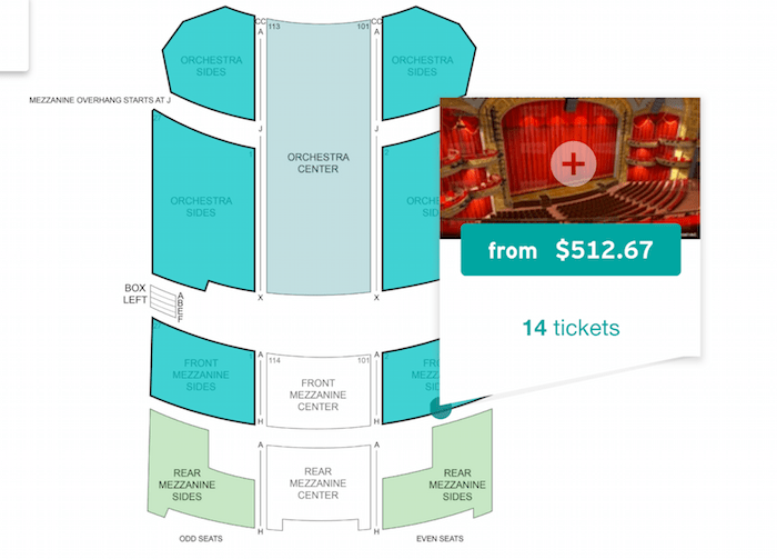
- Showing users their seats virtually (see the below example from Stubhub).
- Preserving customers’ work: If a patron wants to go back to the main calendar page for that month, don’t send them back to the start of their search journey but rather, just one level back.
- International users: Your date format should be clear and understandable outside the U.S. (as much of the world doesn’t follow a month/day/year format and wall-style calendars often start on Mondays).

Avoid Unclear or Redundant Jargon
Sometimes orchestra websites will feature links to series under vaguely catchy, insidery names. A contemporary music series is best called just that – not something like “edge” or “accent.” Outreach events – of which there are usually many – also demand straightforward copy: “School Concerts,” “Adult Education,” “Zoo Concerts.” The Nielsen Norman Group recommends that navigational links be especially clear:
“Category and link names need to make sense on their own, but also in conjunction with other options on the site. If multiple sections or pages could address a specific information need, users must explore each or make their best guess.” Alternatively, they may turn to search or even leave the site.
Develop a Mobile-First Strategy
Surprisingly, I’ve encountered a few large orchestras whose websites aren’t mobile-optimized, nor do they have a mobile app as an alternative environment. Not only does this seem like a sales miss, but it discourages certain kinds of fan interaction, such as the ability to “geo-target” people based on their location or other parameters.
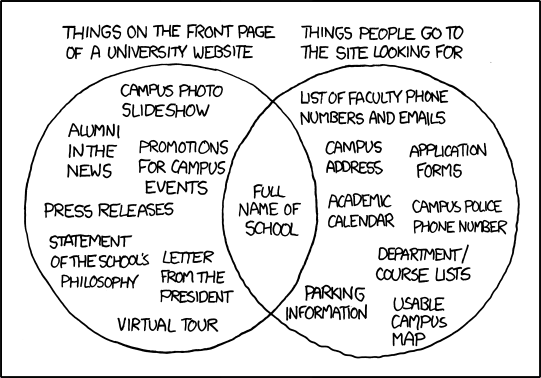
And while I’m all for rich editorial content that builds context and excitement around the programming, remember that users scan, not read, online. It’s a reminder to study one’s Google Analytics and prioritize content accordingly. This amusing xkcd cartoon shows an extreme example of this trap.

Photo: A customer looks at an orchestra website (Matthew Henry/StockSnap.io)


Leave a Reply